Ninja Forms creates the absolute best-looking forms for your website, but there are still times when your forms don’t look exactly as you expect or desire. This document will explain all the ways you can control exactly how your forms are presented.
How Ninja Forms Handles Styling
The thing to note here is that Ninja Forms adds very little styling of its own by default. Instead, we inherit the styling of your theme, the design layer of your WordPress website. What this means is that if your theme adds basic default styling to all HTML form elements, Ninja Forms will look just as your theme author intended. If your theme does not style theme elements or makes strange opinionated decisions, Ninja Form will inherit those as well.
The styling Ninja Forms does add is specifically meant to make sure the various label position options are honored, that error messages and other structural elements are displayed where intended, and that there is enough spacing between field elements. Beyond that, everything else is dependent on your theme.
Ninja Form Opinionated Styles
Ninja Forms includes some opinionated styles in case your theme hasn’t taken the care needed for HTML form elements. You can find the setting in the Advanced Settings section on the Ninja Forms > Settings page on your website.

Think of Opinionated Styles like this: By default, Ninja Forms is like a polite guest at a party – it tries to blend in with whatever your theme is wearing. It doesn’t bring its own strong fashion choices; it just inherits whatever style your WordPress theme has decided to use.
In this scenario, using Opinionated Styles is like Ninja Forms saying : “You know what? Sometimes themes don’t dress form elements very well, so here’s MY opinion on how forms should look.” It’s a backup styling option that Ninja Forms provides when themes haven’t properly styled form elements (or have made weird choices).
To summarize :
* Opinionated Styles OFF = “Use whatever my theme says”
* Opinionated Styles ON = “Ninja Forms takes control and says ‘forms should look like THIS'”
There are options for Light and Dark themes, or you can set it to “None” to disable Opinionated Styles completely.
You can read more about it here :
https://ninjaforms.com/docs/styling-your-forms/
Helper Classes
Ninja Forms comes with a few helper classes that make it pretty easy to add some extra styles to your forms like columns, colors, icons, and more. Below are some instructions on a few of the most commonly requested.
To see these features, you will need to enable Developer Mode in Ninja Forms’ settings.
There are occasions when you want your fields to appear side by side. Helper classes allow you to do that, but are limited. For more robust column handling please check out our Layout & Styles add-on.
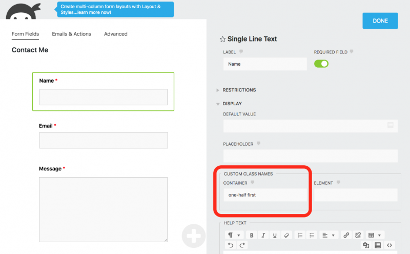
In the above screenshot you will see that we place these column helper classes in the Container option of your Fields Display > Custom Class Names section. Let’s take a look at the classes available for these columns.
- first – This class should be used in the first field in a group of fields that will be displayed side by side.
- one-half
- one-third
- two-thirds
- one-fourth
- two-fourths
- three-fourths
- one-sixth
- two-sixths
- three-sixths
- four-sixths
- five-sixths
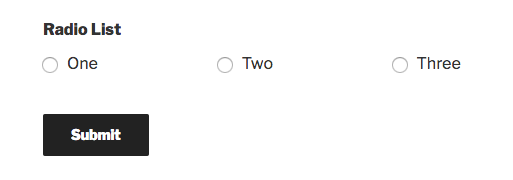
Just like field column classes, there may be a time when you want your checkbox or radio list items into neatly formatted columns.
- two-col-list
- three-col-list
- four-col-list
- five-col-list
- six-col-list
Example using three-col-list:
Layout & Styles
Don’t want to fool with helper classes? Don’t know much HTML or CSS but want to adjust your form’s look and feel? Check out easy mode: Ninja Forms Layout & Styles! Also available in any of our membership plans.