How to Easily Add Buttons to a WordPress Form
Want to try something different to spice up your WordPress forms? Have a link out in your form or an informational popup that needs to open while a user fills out the form? Plain links can be boring. Try buttons! There are a good many reasons why you may want to use one, and they’re super easy to make. Follow along with us below as we walk through how to add buttons to a WordPress form!
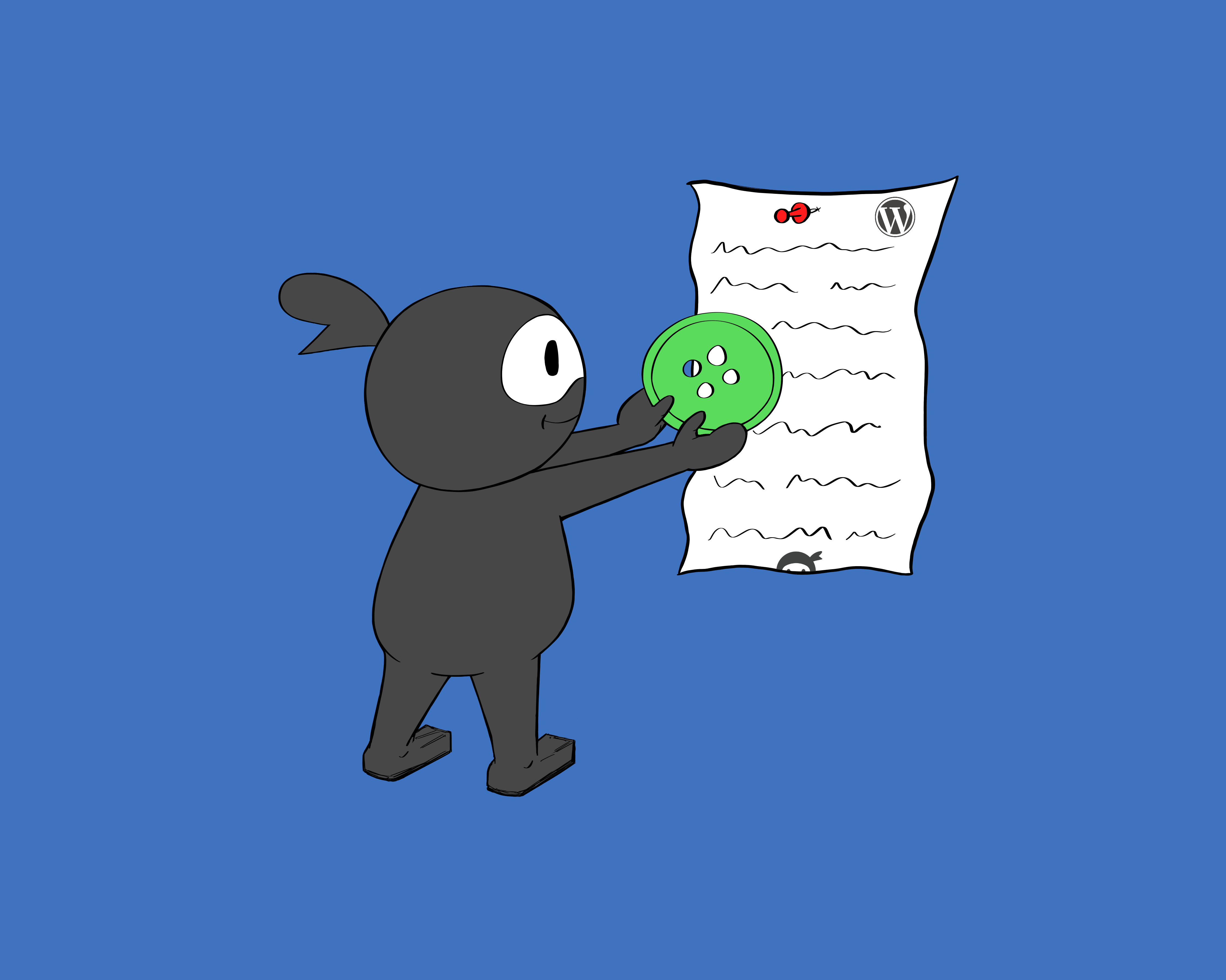
The Ninja Forms’ Summernote Editor
Buttons take HTML and CSS to create, and that can make for a real headache for those of you who aren’t familiar with the two. Where to add what? Which file? How? Am I going to mess something else up? AHHH!
Let us make this incredibly easy for you. Ninja Forms uses the Summernote WYSIWYG editor in several different places throughout the builder. This makes customization that normally requires HTML and CSS to be input into different files accessible to you in one easy location inside your form builder. For example, styling your emails is incredibly easy using Summernote.
We’re going to leverage the Summernote editor that can be found in the HTML field within your Ninja Forms builder. Placing your HTML and inline CSS within it saves you time and energy whether you know what files you’d otherwise have to look for or not. Let’s begin!
Add Buttons to a WordPress Form!
There are a variety of different ways we can add buttons to a WordPress form and a variety of different uses we can put them to. For this example, we’ll be building a button by creating a button class and then styling it. In my own experience, this offers the greatest flexibility and is super easy. Functionally, it will open a new tab to a destination URL we specify. If you have no idea what I’m talking about, no worries. We’ll walk through it below.
Step 1: Add an HTML field to your form
The HTML field will literally become our button. Just add it to your form wherever you want the button to appear, and in the toolbar above the rich text editor, click the <> icon. This toggles us over to a part of the editor where we can directly input HTML and CSS. You should be looking at this:

Step 2: Enter the HTML & CSS to create your button
No clue how to do this? No fear. You can copy and paste if you like the button I made, and if not we’ll break everything down so that you know what to adjust. Here’s the code:
Just copy and paste that directly into the <> view of the editor. Click “Done” and preview your form now. Here’s what you should see:

It’s a button! You like my clever choice of lime green for this button? No? Can’t blame you. Want to adjust the dimensions of the button? Change the border? The text? Let’s break down the parts of this code so that you understand what you’re looking at and can make adjustments.
Step 3: Making Adjustments
Here’s our code to add buttons to a WordPress form again for reference. We’ll go through it line by line to show you what each part does and how it can be adjusted.
- Line 1: This sets up a redirect to ninjaforms.com that will open in a new tab when the button is clicked. Pasting a new URL over the Ninja Forms URL will send users to a different location on click. “target=”_blank” is what tells the redirect to open in a new tab, leaving the tab with the form in it open. Class=”button” defines this as a button. “Click Me” can be replaced with whatever text you want to appear in the button.
- Lines 2 & 11: Opening and closing tags for our styling. Don’t change these, or things will break 🙂
- Line 3: Remember the class=”button” in line 1? This line tells us the styling that follows is specific to that button class.
- Line 4: This gives the button a box or block shape. There are others that you can use if you want to experiment.
- Lines 5 and 6: This determines the height and width of the block. Experiment around to find the size that works best for you!
- Line 7: This sets the background color for the button. Hate my choice of lime green? Choose your own!
- Line 8: This aligns the text in the center of the block.
- Line 9: It’s not terribly visible with the color scheme I’ve chosen, but there’s a border that runs around the block. Use this to change its color.
You Have a Button!
That’s all there is to it, although there’s a lot more that can be done with it. That link goes to W3 Schools, an excellent resource for teaching yourself more if you’re interested. What are you using buttons for? We’d love to know, so please share in the comments below! That goes for questions, too- ask away!
Try Ninja Forms Today
Always free, with premium features available through our memberships.
How do you get it to actually submit to the Ninja forms database?
Shanita,
Hey! Each submission is stored int he WordPress database itself, and is viewable via Ninja Forms>Submissions.
Please feel free to reach out to our support channel if you need a hand here! https://ninjaforms.com/contact/
Cheers,
Quay
How is the email address field and subscribe button aligned next to each other in the newsletter subscription form at the bottom of this page?
Harris,
Layout and Styles! https://ninjaforms.com/extensions/layout-styles/
Cheers,
Quay
Nija forms have always been very helpful to me. Thank you so much guys! you have developed the best plugin ever! has been great help to my site. I cannot thank you guys enough.
Always love to hear this, so glad to be able to help!
How do i create subscribe button with ninja forms ?
Your best bet for a Subscribe button would be to just use the Submit field and rename it Subscribe (click on it in the builder to open the field settings, then replace Submit with Subscribe). It’s already styled as a button, so no extra work there 🙂
Cheers,
Quay
This may be complicated to explain but its my GDPR (UK data protection that doesn’t allow you to capture leads in exchange for an offer without express consent) workaround and I want to know if Ninja Forms has the capability. My lead magnet offer would have the following:
– Description of offer
– Box to enter email
– Text that says something like: while we’re here why not join our mailing list
– Large button that says: Join (joins mailchimp/convertkit list AND gets sent offer as an email automation)
– Small linked text under button that says: No thanks, just send me my offer (gets sent offer as email automation but doesn’t get added to mailchimp/convertkit list)
Hi,
Yes, this is achievable within Ninja Forms. We have an article available with instructions on how you can make your mailing list forms (such as MailChimp and Convertkit) compliant with GDPR. You can view this here:
https://ninjaforms.com/gdpr-compliance-wordpress-forms/
If you encounter any issues or have followup questions, please reach out to us at https://ninjaforms.com/contact/ in order to get a timely response. There, we offer support free support directly to our Ninja Forms users with significantly more privacy and a faster response time.
Best regards,
Curtis
WP Ninja
Is it possible to use this technique to create a Print button on a Ninja form so the user can print their submission out to their printer?
Possible yes, but not without some custom work. That would take a bit of programming for the button to actually communicate to the printer, and that’s not something the plugin is capable of right now. Sorry.
Hi,
I have a form in my website, and I want to give customers 2 options when they fill it:
Option 1 – Proceed to payment
Option 2 – Call us on WhatsApp to know more
How can I do this? I want the infos from clients to be stored as usual, but according to what the user wants, he/she would be redirected to a different link. What I wanted is the option to have 2 submit buttons on the same form, each one going to one link, both keeping user data they filled registered.
Can this be done with Conditional Logic Addon? Or maybe with another one? Can you help me with that?
Thanks!
Amanda