The Conversational Forms add-on presents any Ninja Forms form one question at a time. Your form stays exactly as you built it: the same fields, validation, actions, and submissions. The add-on only changes how visitors experience the form.
Before You Start
- WordPress 6.8 or later and PHP 7.4 or later.
- The Conversational Forms add-on installed and activated. Enter your license key under Ninja Forms > Settings > Licenses to receive updates.
- An existing form, or the Conversational Form template. The add-on adds a Conversational Form template to the new form screen with a five question example that is already set up.
Enabling Conversational Forms
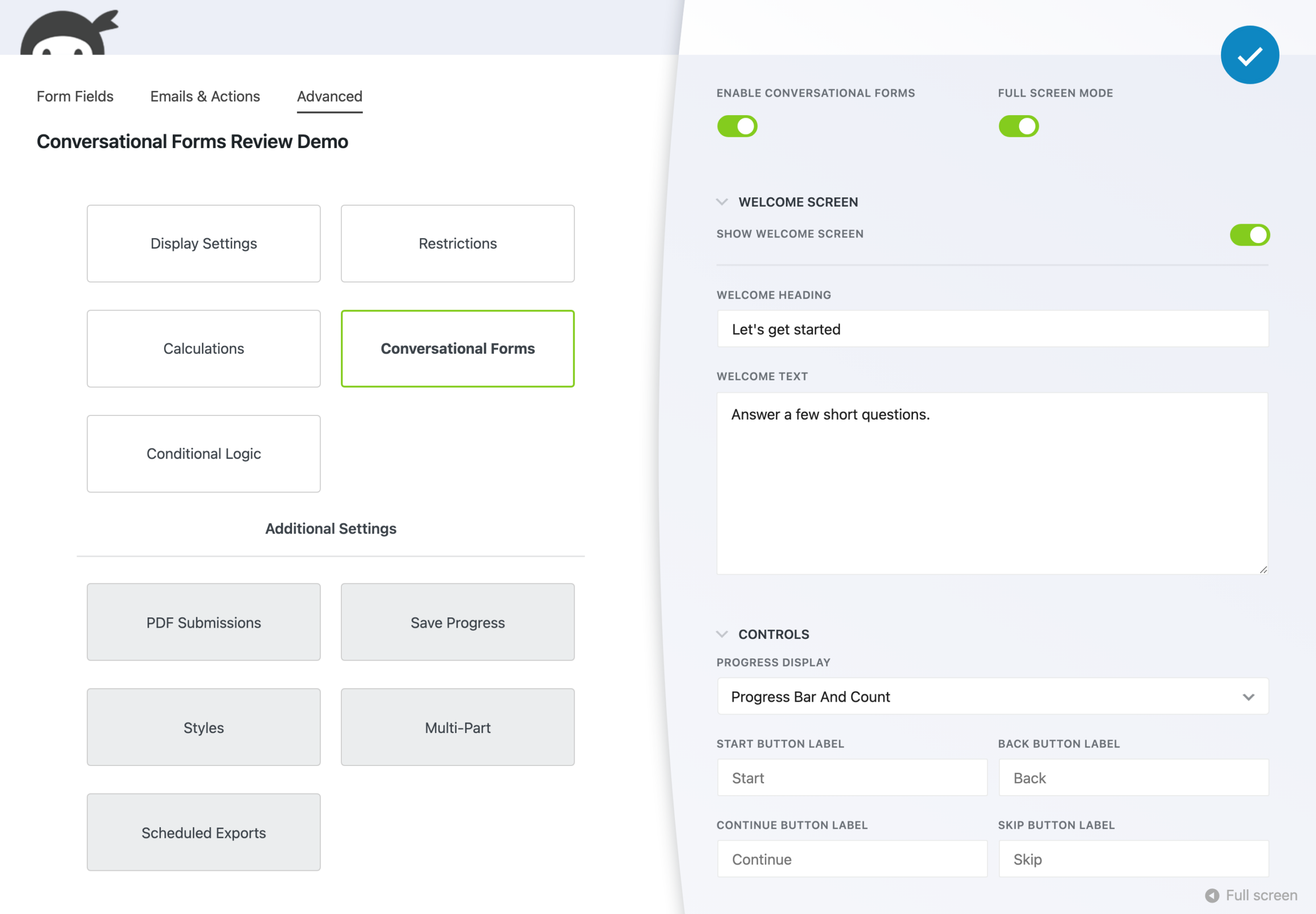
- Open the form in the builder and go to Advanced > Conversational Forms.
- Turn on Enable Conversational Forms.
- Optionally turn on Full Screen Mode. See Full Screen Mode and Public Links below.
- Click Done, then Publish.
Each field in the form becomes one step. Visitors move between steps with the Continue and Back buttons, and the form’s normal submit button appears on the last step. Required field validation runs on each step before the visitor can continue.
Welcome Screen
The welcome screen appears before the first question and is on by default. Open the Welcome Screen section under Advanced > Conversational Forms to change it.
- Show Welcome Screen: turn off to open the form directly on the first question.
- Welcome Heading: the heading shown on the welcome screen. Leave blank to use the form title.
- Welcome Text: optional supporting text shown under the heading.
The logo set in the Appearance section also appears on the welcome screen.
Controls
The Controls section sets the progress display and the button labels.
- Progress Display: choose Progress Bar, Question Count, Progress Bar and Count, or None. The question count only includes steps that are currently visible, so it updates when Conditional Logic shows or hides a field. The welcome and completion screens are not counted.
- Start Button Label, Back Button Label, Continue Button Label, Skip Button Label: replace the default button text, for example to translate it. Leave a field blank to use the default label.
The button on the final step uses the label of the form’s Submit field, so change it there.
Appearance
The Appearance section shows a live preview that updates as you change each option.
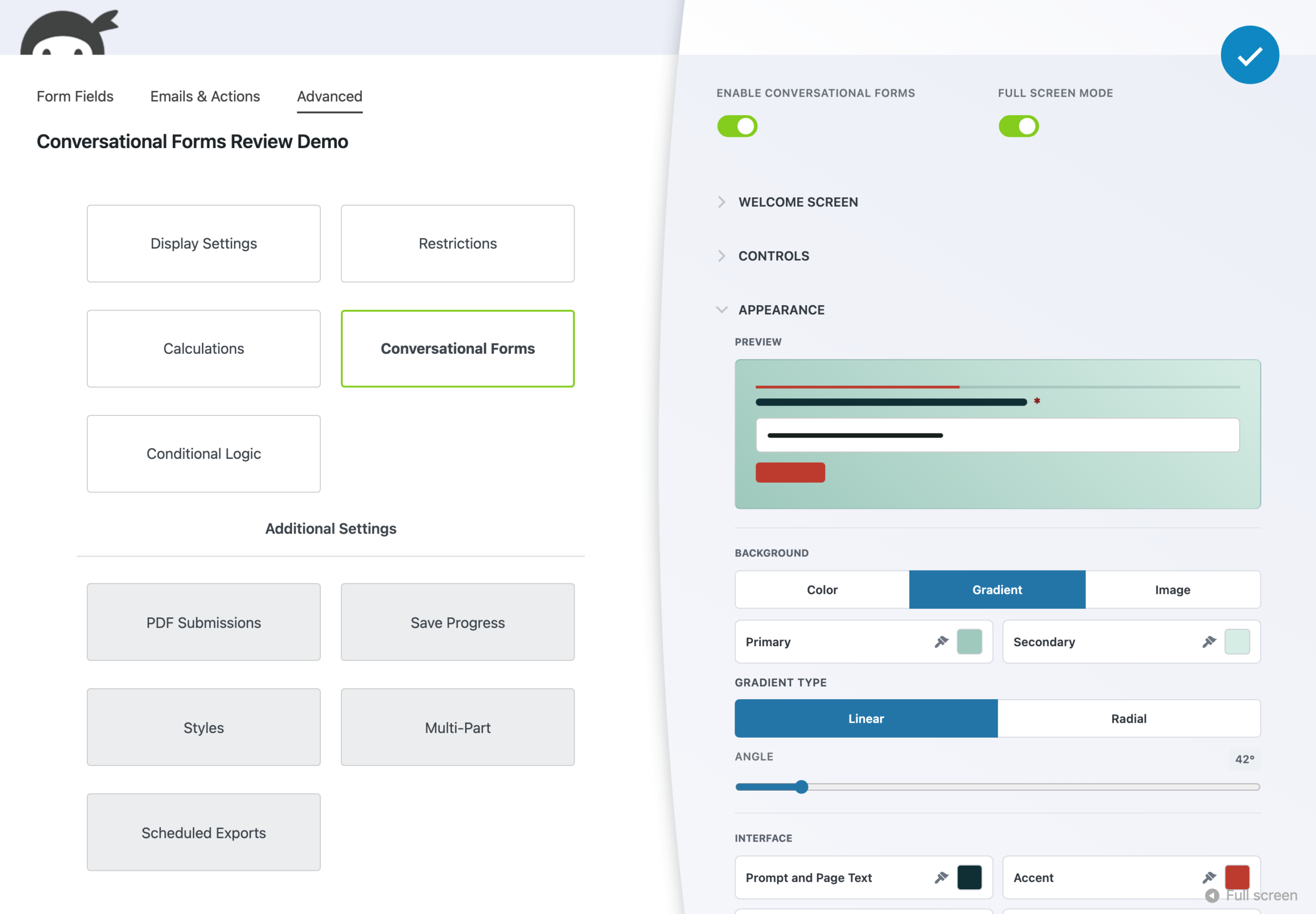
- Background: choose Color, Gradient, or Image. A gradient has a primary and secondary color, a Linear or Radial type, and an angle. An image is selected from the Media Library.
- Interface colors: Prompt and Page Text, Accent, Field Text, Field Background, and Validation. Click a swatch to pick from your theme’s colors, enter a hex value, or open the color picker.
- Logo: an image from the Media Library shown on the welcome screen.
If a text color may be hard to read on the background you chose, a warning appears under the preview. The warning does not block saving. The default colors meet WCAG AA contrast.
Full Screen Mode and Public Links
By default the conversational form displays in the form’s normal position on the page. With Full Screen Mode turned on, the welcome screen still appears in place, and the form takes over the full browser window after the visitor clicks Start. The close button in the corner returns the visitor to the page with their answers kept.
A form’s public link always opens in the full screen welcome experience, whether or not Full Screen Mode is on. Closing a public link form returns the visitor to your site’s home page. If they have entered any answers, they are asked to confirm first.
What Conversational Forms Supports at Launch
Conversational Forms changes how a form is presented, not how it works, and this first release covers the everyday form. The fields, actions, and settings below are supported in a conversational form. Anything not listed is not yet supported: turn off Enable Conversational Forms on any form that needs it, and keep that form as a regular form.
Fields
This release supports these field types in a conversational form:
- HTML
- First Name
- Single Line Text
- Phone
- Paragraph Text
- Radio List
- Select List
- Checkbox List
- Single Checkbox
- Submit
Radio list options can be chosen with the letter shown next to each option. Hidden fields, Notes, and Dividers are passed over rather than shown as steps.
Other field types, including File Uploads, are not yet supported in a conversational form.
Actions
Every action runs as usual when a conversational form is submitted: email notifications, success messages, redirects, Create Post, and every CRM, email marketing, and automation integration. The one exception is payments. Payment actions (PayPal Checkout, Stripe, Authorize.net, Elavon, and Recurly) are not yet supported in a conversational form.
Advanced settings
The other settings under the Advanced tab work as usual, including Display Settings, Restrictions, Conditional Logic, Multi-Part Forms, Layout & Styles, and public links. Conditional Logic rules work between steps, with hidden fields skipped and the question count updated, and a Layout & Styles row or a Multi-Part Forms part becomes one step. Calculations, and the Save Progress add-on, are not yet supported in a conversational form.
Is there a field, action, or setting you would like Conversational Forms to support? Let us know. Requests like that shape our direction and our priorities, and the more people who ask for something, the higher it moves up the list.
Keyboard and Screen Reader Use
Visitors can complete a conversational form with the keyboard alone. Tab reaches the Start, Back, Continue, and close buttons, and arrow keys move between list options. Each step announces its position, for example “Question 2 of 6,” followed by the question. In full screen mode the rest of the page is hidden from assistive technology until the form closes. The entry animation is turned off for visitors who have reduced motion enabled in their operating system.